Imagine this: You're searching for a new restaurant on your phone. You find a promising website, but the text is tiny, the images are blurry, and buttons are impossible to click. Frustrated, you give up and move on. This scenario, unfortunately, is all too common with websites not designed for mobile devices.
In today's digital landscape, where smartphones and tablets are our constant companions, a responsive web design is no longer a luxury – it's a necessity. Here at Pixenite, a leading web design agency in Ahmedabad, we understand the importance of creating websites that adapt seamlessly to any screen size, from desktops to mobile devices.
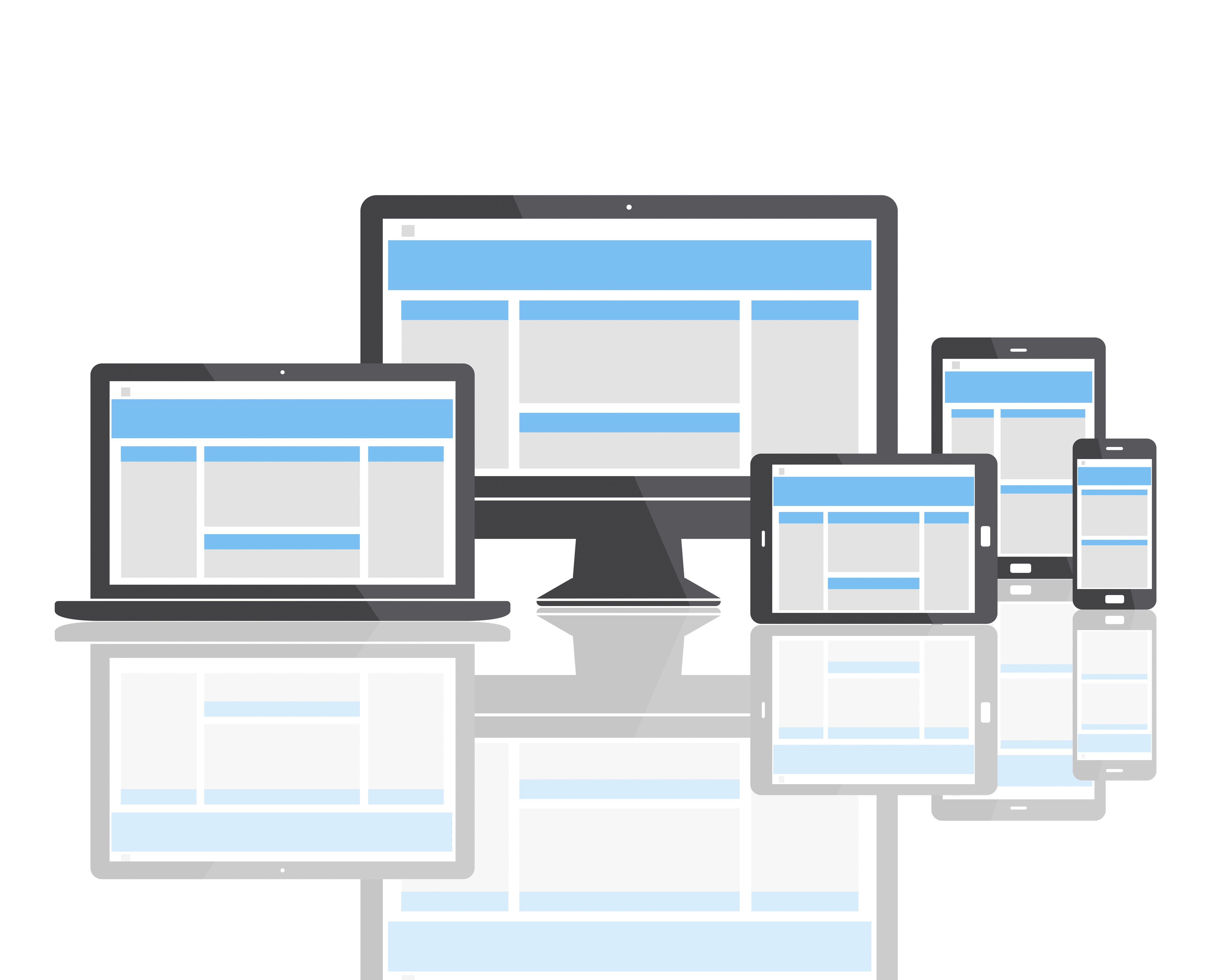
What is Responsive Web Design ?
RWD is a web design approach that ensures your website seamlessly adapts to any screen size, from desktops and laptops to tablets and smartphones. The layout, content, and images adjust automatically, offering an optimal viewing experience regardless of the device used.
Think of it like a chameleon – your website adapts its colors and form to perfectly blend with its screen size.
The Benefits of Responsive Web Design
Here's a closer look at the many advantages that come with a responsive web design:
Enhanced User Experience: Visitors can easily navigate your website, read content, and complete actions (like making a purchase) without zooming, scrolling sideways, or pinching the screen. It gets higher engagement and satisfaction from this.
Improved Search Engine Optimization (SEO): Search engines like Google prioritize mobile-friendly websites in their search results. By having a responsive design, you increase your chances of ranking higher and attracting more organic traffic.
Cost-Effectiveness: Maintaining a separate mobile website can be expensive and time-consuming. Responsive design offers a single, unified solution that works across all devices, saving you money and resources.
Future-Proofing Your Website: You need to adapt to constantly emerging new devices and screen sizes. A responsive design ensures your website remains adaptable and user-friendly for years to come.
Brand Consistency: Responsive design maintains a consistent brand image across all devices, reinforcing your message and strengthening your brand identity.
Creating a Responsive Website: A Simple Breakdown
The process of creating a responsive website involves using flexible layouts, fluid images, and media queries.
Flexible Layouts: These layouts use grids and percentages to ensure content adjusts to different screen widths.
Fluid Images: These images resize automatically to fit the available space on the screen.
Media Queries: These are CSS commands that instruct the website how to display content based on specific device characteristics, like screen size and orientation.
While the technical details may seem complex, the core idea is straightforward: your website should adapt to the user, not the other way around.
Conclusion
By prioritizing responsive design, you're not just creating a website – you're crafting a positive digital experience for your audience, regardless of the device they use. Here at Pixenite, we understand the ever-growing importance of mobile users and can help you design and develop a website that not only looks stunning but also adapts and thrives in today's mobile-driven world.
We offer a comprehensive web design service that caters to your specific needs and budget. Let's discuss how we can help you create a responsive website that delivers exceptional results. Contact us today for a valuable consultation!
FAQ’s
Q: Do I need a separate mobile website if I have a responsive website?
No, a responsive website means you don't need a separate mobile site anymore. One website caters to all devices, saving you time and money.
Q: How can I check if my website is responsive?
There are several online tools you can use to test your website's responsiveness. You can also try viewing your website on a phone or tablet to see how it looks and functions.
Q: Is responsive web design expensive?
While creating a new responsive website from scratch may involve an investment, it's generally more cost-effective than maintaining separate desktop and mobile websites in the long run.
Q: Can I make my existing website responsive?
Yes, in many cases, an existing website can be converted to a responsive design. The feasibility and cost will depend on the complexity of your current website and the coding language used. It's best to consult with a web design professional to assess your specific situation and determine the best course of action.
Q: What are the next steps if I want a responsive website?
Partner with a reputable web design agency that specializes in responsive design. They can assess your needs, create a custom design, and implement a responsive website that delivers a seamless experience for your visitors across all devices.
Article Source - https://medium.com/@pixenite/why-responsive-web-design-matters-in-a-mobile-world-41f4485f1d82